Casa Lumina
A boutique hotel website built to win the direct booking.
- Client
- Casa Lumina (concept)
- Services
- Brand identity, Web design, Booking UX, Art direction
- Year
- 2026
- Concept site
- Open the concept →
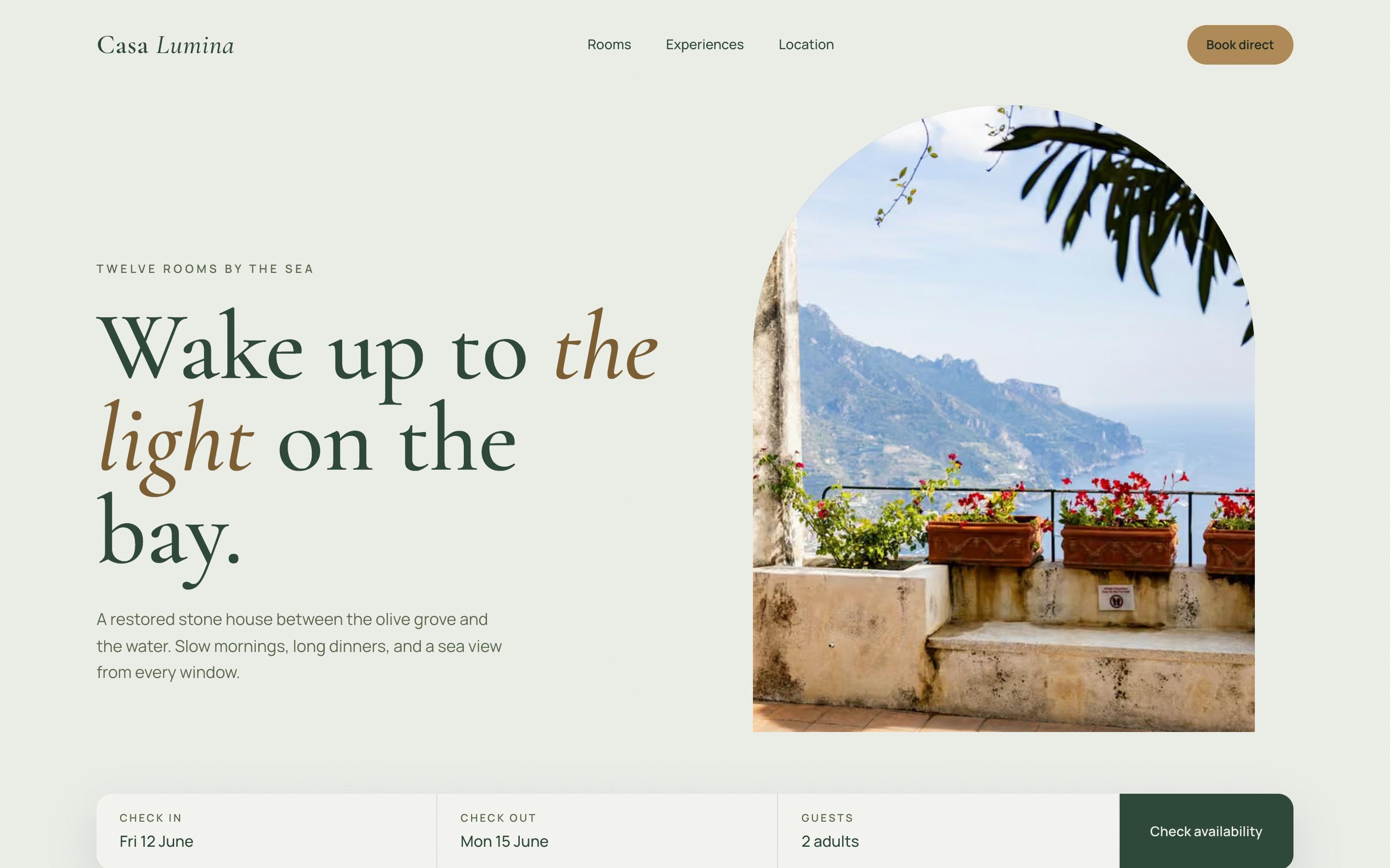
A concept for a twelve-room hotel by the sea: a calm sage-and-stone brand, a booking-first homepage and photography framed in the house's old stone arch.
The brief
Casa Lumina is a fictional hotel we created to show how we approach hospitality: twelve rooms in a restored stone house between an olive grove and the sea.
The brief we set ourselves is the one most small hotels share. Guests find you on Booking.com, then search your name. If your own site is slow, generic or hard to book, the commission goes to the OTA. The website's job is to make booking direct the obvious choice.
Decisions
- Booking above the fold. Dates, guests and “Check availability” sit directly under the headline, not three clicks deep.
- A reason to book direct. Best rate, free late checkout and a bottle of olive oil, stated next to the booking bar.
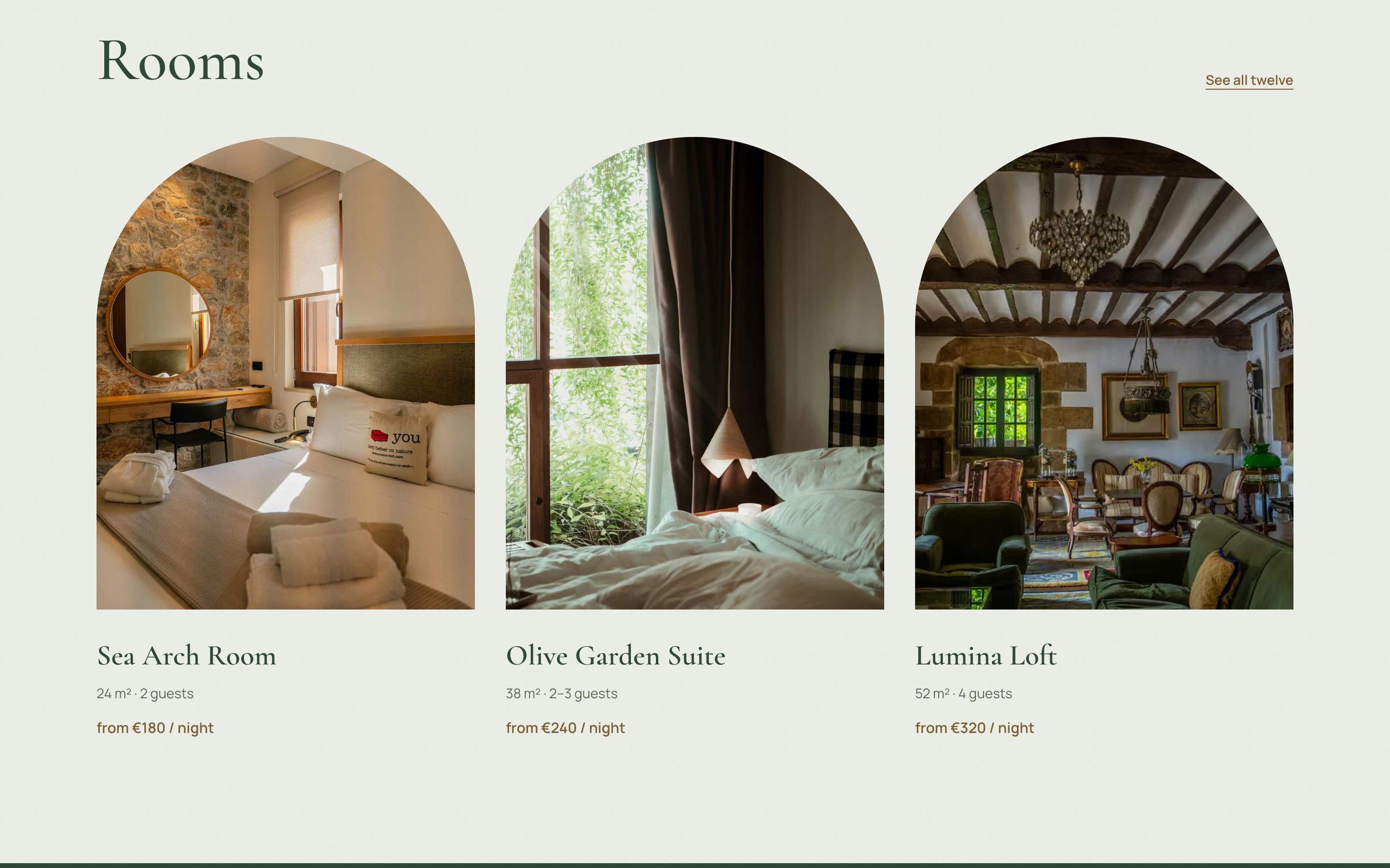
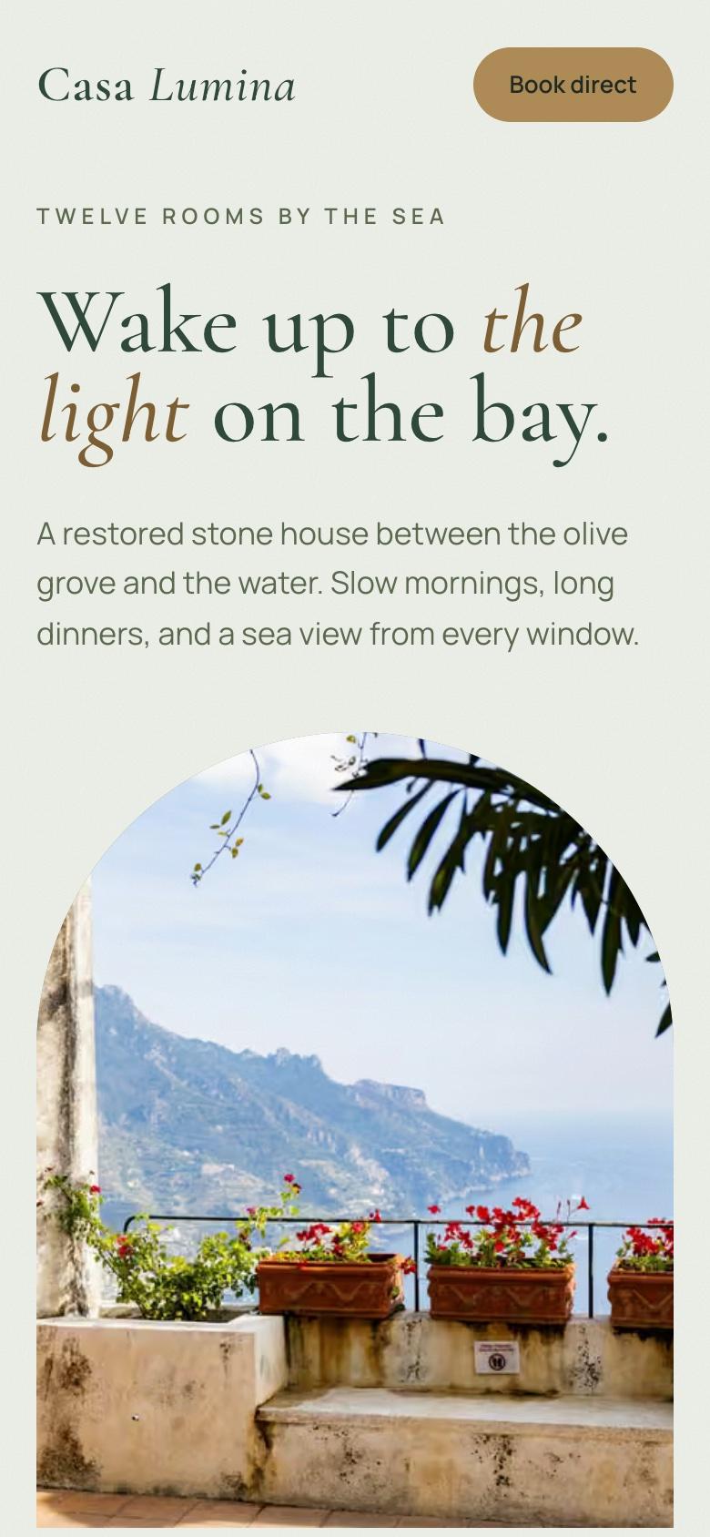
- The arch as the brand. One shape, the house's old stone arch, frames the hero and every room photo, so even stock photography feels like one place.
- Quiet typography. Cormorant for the voice of the place, Manrope for prices and practical details.
- Rooms that answer the real questions. Size, guests and the nightly price on every card.
The system
Sage and stone: misty sage for the page, deep forest green for text and evening sections, brass for the booking buttons. Every text colour is checked for contrast, and the forest sections give the page a rhythm of day and evening as you scroll.
The photography is licensed stock from Unsplash, credited on the site. For a real hotel we would plan a shoot of the actual rooms.
- screen to start a booking
- 1
- screen to start a booking
- colours, all from the landscape
- 4
- colours, all from the landscape
- typefaces: one to feel, one to read
- 2
- typefaces: one to feel, one to read
See it live
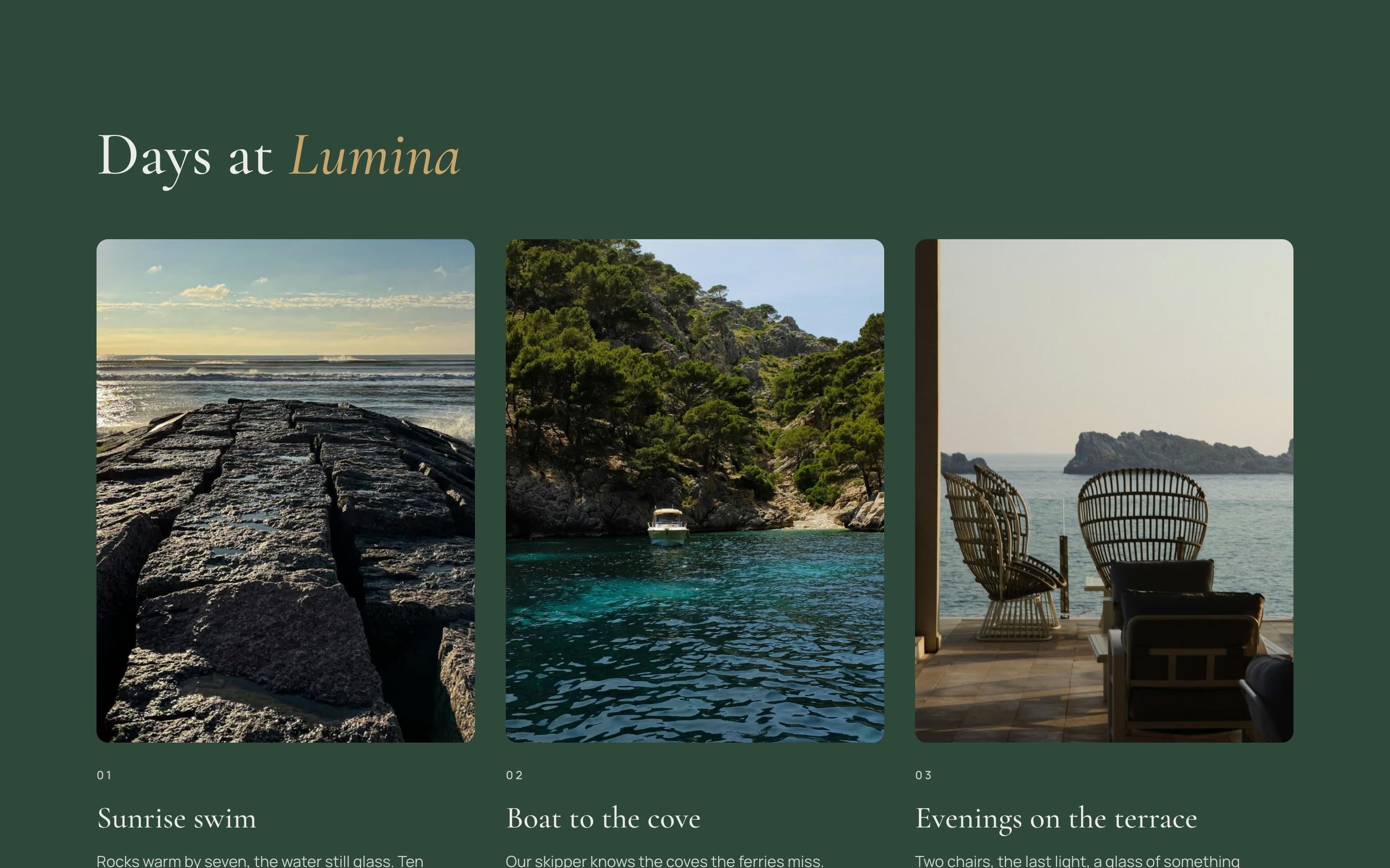
The concept is a working one-page site. Open Casa Lumina to click through it, on desktop or on your phone.
Konoba Mare