Your Hotel Homepage Has 5 Seconds: What Guests Look For
Guests decide whether to stay on your hotel homepage in a few seconds, mostly on a phone. Here is what they look for first, what to put above the fold, and what to move lower down.
In the first few seconds on your hotel homepage, a guest wants to know four things: what the place looks like, where it is, roughly what it costs, and how to book. If the top of your page answers those four questions on a phone, without a pop-up in the way, you have done most of the work. If it shows a slow slider and a vague slogan, many guests go back to the booking site they came from.
The "5 seconds" in the title is a rule of thumb, not a lab figure. The research below shows why it is a fair one, and the rest of this guide shows what to put in that space.
Key takeaways
- First impressions are almost instant: people rated web pages after seeing them for 50 milliseconds, and those ratings matched their slower judgments (Lindgaard et al., 2006).
- The top of the page gets most of the attention: 57% of viewing time was spent above the fold in a Nielsen Norman Group eye-tracking study (2018).
- Phones come first: 67% of bookings on Net Affinity's UK and Irish hotel sites were made on mobile in Q4 2025.
- The fix is simple: one strong photo, your location, a booking bar and a line of proof, all loading fast.
How fast do guests judge a hotel homepage?
Faster than you can read your own headline. In a study published in Behaviour and Information Technology in 2006, Gitte Lindgaard and colleagues at Carleton University showed people web pages for just 50 milliseconds. Their ratings of visual appeal closely matched the ratings people gave after looking for longer. A guest has a gut feeling about your hotel before they have read a word.
Jakob Nielsen's analysis of page-visit data (Nielsen Norman Group, 2011) found that users often leave pages in 10 to 20 seconds, and that the chance of leaving is highest in the first few seconds. The first 10 seconds decide whether someone keeps reading.
Speed adds to the pressure. Google's 2016 "Need for Mobile Speed" research found that 53% of mobile visitors leave a page that takes longer than three seconds to load. If your hero image is still loading at second four, the guest's first impression is a blank screen.
Why does the top of the page matter so much?
Because that is where people look. In Nielsen Norman Group's 2018 eye-tracking study of 120 people, 57% of page-viewing time was spent above the fold, the part of the page you see before scrolling. 74% was spent in the first two screens.
Guests do scroll, but they scroll when the top of the page gives them a reason to. That top section has two jobs: show that this is the kind of stay they want, and show them the next step.
On a hotel site, the top of the page is mostly seen on a phone. Net Affinity, which runs websites and booking engines for hotels in the UK and Ireland, reported in January 2026 that 67% of bookings across its clients were made on mobile in the last quarter of 2025. Design the top of your homepage for a phone screen first, then check how it looks on a laptop.
What do guests look for first on a hotel homepage?
Here is what a good first screen holds, in the order most guests need it. The wireframe below shows one way to lay it out on a phone.
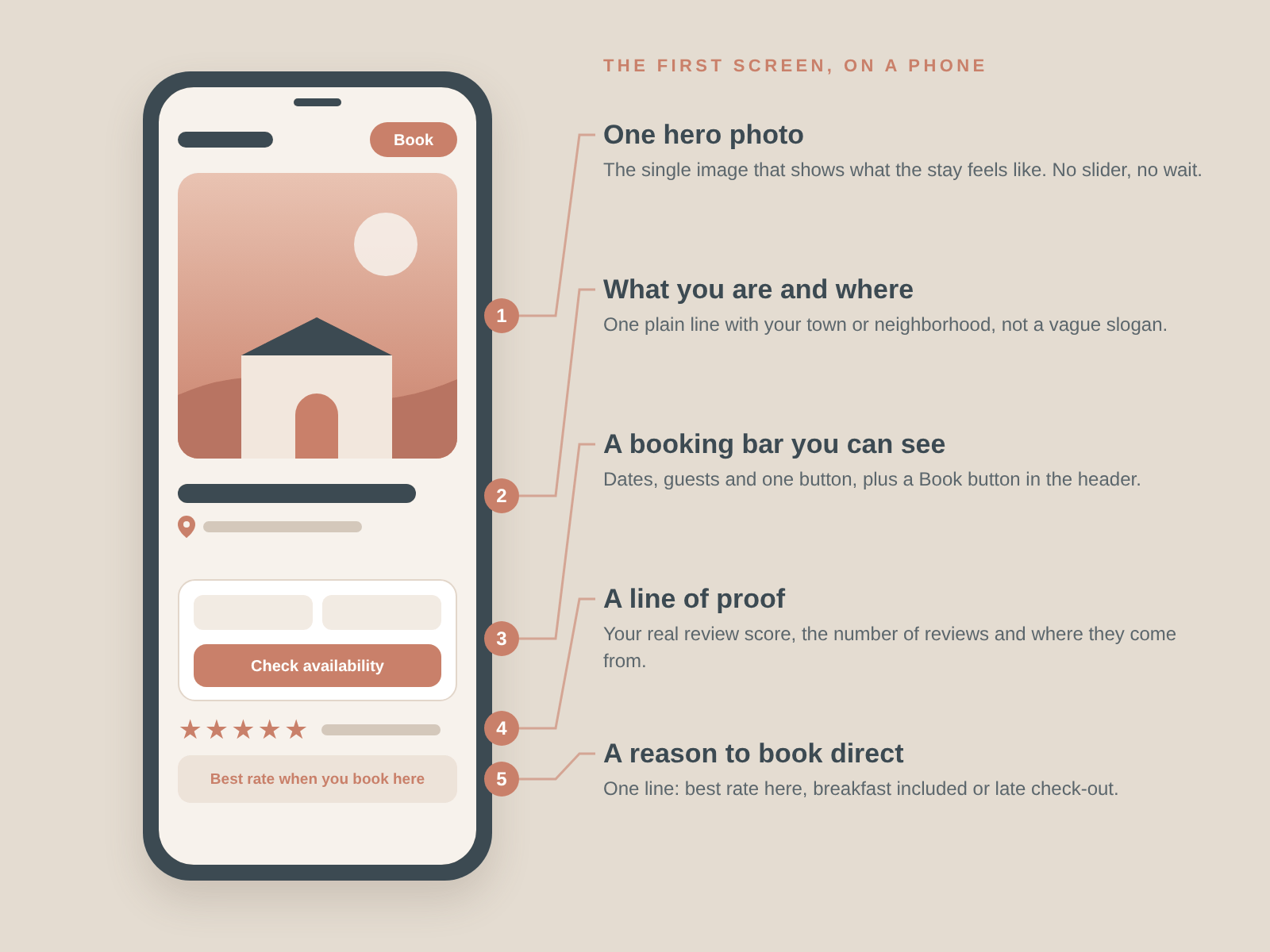
1. One hero photo that shows the stay
Pick the single photo that best answers "what will it feel like to be here?" That might be your best room in morning light, the view from the terrace, or the courtyard at dinner. One strong image beats a slider, which hides most of its slides and slows the page down.
Keep the file small. A hero photo saved for the web, in a modern format like WebP, can look sharp and still load in time. Google's Core Web Vitals ask for the main content to load in 2.5 seconds or less, and the hero photo is usually that main content.
2. A one-line promise and your location
Under or over the photo, write one plain sentence that says what you are and where. An example: "A 12-room guesthouse in Kotor's Old Town, two minutes from the sea" tells a guest more than "Where memories are made." Location is often the first filter a traveler uses, so put the town or neighborhood in that line, not only on the contact page.
3. A booking bar they can use right away
Dates, guests and a "Check availability" button should be visible without scrolling. On a phone, a sticky "Book" button in the header works well too. If guests have to hunt for the booking engine, some of them will book on an OTA instead.
This matters because guests are quick to give up. In SiteMinder's Changing Traveller Report 2025, a survey of about 12,000 travelers in 14 countries, 52% said they had abandoned an online booking because of a bad experience. Our guide to mobile-first booking and one-tap payments covers what happens after they tap the button.
4. A line of proof
Guests want to know other people liked it. A small strip with your review score, the number of reviews and the source (for example, Google or Tripadvisor) builds trust fast. Only show real, current scores, and link to where they come from. An award or a short real guest quote works too, if you have permission to use it.
5. A reason to book direct
Many guests find you on an OTA and then check your website. SiteMinder's Changing Traveller Report 2026 found that 18% of travelers who start their search on an OTA end up booking directly with the hotel. Give them a reason: a "Best rate when you book here" note, free breakfast, late check-out or a welcome drink. Keep it to one line near the booking bar.
What should you move lower down the page?
A first screen gets cluttered fast. These items still belong on your homepage, just not at the top:
- Long welcome text: two or three short paragraphs about your story work well further down.
- Every room type: show room cards below the fold, each linking to its own page.
- Social media feeds: they load slowly and send guests away from your site.
- Newsletter pop-ups: a pop-up that covers the photo and the booking bar in the first seconds works against you. If you use one, show it later or on exit.
- Auto-playing video with sound: if you use video, keep it short, silent and light, and have a still photo as a fallback.
Lower on the page, guests who keep scrolling look for rooms, photos of the details, what is nearby, a map, and answers to common questions. Our high-converting landing page checklist covers that full page, section by section.
How do you test your own homepage in five minutes?
You don't need special tools for a first check. Try this:
- The phone test: open your homepage on your phone, on mobile data, not Wi-Fi. Count how many seconds pass before you can see the hero photo and the booking bar.
- The stranger test: show the first screen to someone who doesn't know your hotel for five seconds, then hide it. Ask them what kind of place it is, where it is and how they would book. If they can't answer all three, that is your fix list.
- The speed test: run your homepage through Google PageSpeed Insights, which is free, and look at the mobile result for Largest Contentful Paint. Aim for 2.5 seconds or less.
- The AI test: ask ChatGPT or Google what your hotel is and where it is. If the answer is vague, your homepage text may be too. Our guide on getting your hotel recommended by ChatGPT explains why clear text helps.
If speed is the problem, our post on how a fast mobile site increases room revenue explains the common causes in plain English.
What does a homepage redesign cost?
At Art of the Code, a Website Redesign of your existing site starts from $499 and includes a new design, a mobile-friendly and fast build, SEO basics and a contact or booking form. Brand & Website starts from $799 and adds a logo and brand identity. Premium starts from $1,099 and adds a social media design kit and Google Business Profile setup. For a fuller picture of prices across the market, see how much a boutique hotel website costs.
FAQ
What should be above the fold on a hotel homepage?
One strong hero photo, a one-line description with your location, a booking bar with dates and a clear button, and a short line of proof such as your review score. On a phone, keep a "Book" button in the header so guests can book from anywhere on the page.
Is a homepage image slider bad for a hotel website?
Usually, yes. Most visitors only see the first slide, sliders add weight that slows the page, and moving images can distract from the booking bar. One carefully chosen hero photo, with a gallery further down the page, does the same job faster.
How fast should a hotel homepage load?
Aim for the main content, usually the hero photo, to appear in 2.5 seconds or less on a phone. That is Google's "good" target for Largest Contentful Paint. You can check your score for free with Google PageSpeed Insights.
Should the booking engine be on the homepage?
The booking bar should be, yes: dates, guests and a button that opens your booking engine with those details filled in. Guests who have to find a separate "Book" page or re-enter their dates are more likely to give up or go back to an OTA.
Do pop-ups hurt hotel website bookings?
A pop-up that appears straight away and covers the photo and booking bar gets in the way at the moment guests decide whether to stay. If you want email sign-ups, show the offer later in the visit, on exit, or as a small banner that doesn't block the page.
The bottom line
Your homepage doesn't need more on it. It needs the right four things at the top: what the stay looks like, where it is, why it is worth it, and how to book, all loading fast on a phone. Today, open your homepage on your phone and run the stranger test with one person. Their three answers will tell you what to fix first.
Want a second opinion on your homepage? Book a call and ask for a free look at your site.
Sources
- Nature News, "Web users judge sites in the blink of an eye" (January 13, 2006; on Lindgaard, Fernandes, Dudek and Brown, Behaviour and Information Technology 25, 2006)
- Nielsen Norman Group, Jakob Nielsen, "How Long Do Users Stay on Web Pages?" (September 11, 2011)
- Nielsen Norman Group, Therese Fessenden, "Scrolling and Attention" (April 15, 2018; eye-tracking study of 120 participants)
- Marketing Dive, "Google: 53% of mobile users abandon sites that take over 3 seconds to load" (September 12, 2016; DoubleClick by Google, "The Need for Mobile Speed")
- Net Affinity, "How Mobile Booking Will Dominate the Hotel Industry in 2026" (January 29, 2026; client booking data, Q4 2025)
- Hotel Technology News, "More than Half of Travelers Abandon the Online Booking Process Due to Poor User Experience" (November 15, 2024; SiteMinder Changing Traveller Report 2025, about 12,000 travelers in 14 countries)
- SiteMinder, "Latest trends in the hotel industry" (last updated November 26, 2025; Changing Traveller Report 2026)
- web.dev, "Web Vitals" (updated October 31, 2024)

Djaner Bekir · Founder of Art of The Code. 15+ years in destination management, now building websites for hotels and restaurants. About
Want a website that turns lookers into bookers?
Related posts
 Trends & design9 min read
Restaurant Website Must-Haves: 12 Features That Fill Tables
 Trends & design6 min read
Rural Reset: Capturing Demand for Nature-Led Stays
 Trends & design6 min read
Spontaneous Stays: Designing for the Last-Minute Traveler